Artifact 6: Midterm Project - TWC 514 Visualizing Data and Information
- ecmurph4
- Apr 4, 2021
- 2 min read
Updated: Apr 19, 2021
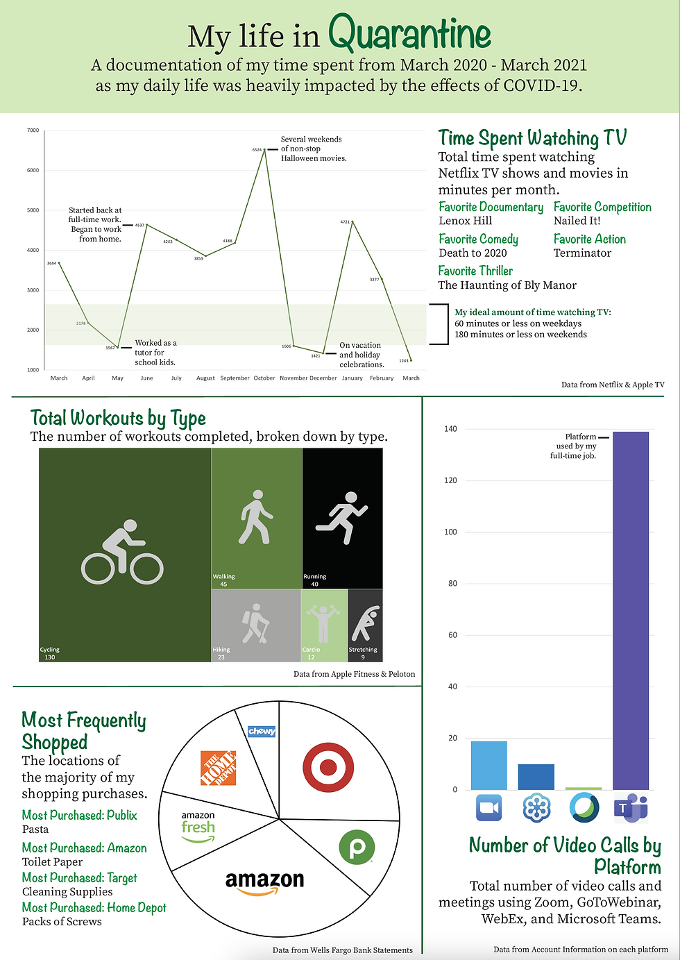
My final artifact was my most recently completed project. For this assignment we were tasked with taking personal data and turning it into a visually appealing document. When reflecting back on my time at ASU, I realize that I have come a long way from completing my project for Artifact 1 to completing this project. With this project my first thought was, "What would my user want to know, and how can I show that in the most appealing way possible?" I no longer think about what it is that I want to design and do, but rather first think of the user which has helped me to see that I have stepped up to the threshold of understanding that the end user's needs and wants are the most vital to a technical communicator.
By keeping this mentality when creating this project, I was able to effectively create appealing graphs with clear data and utilize color in an effective but subtle way, while still telling a creative and meaningful story that many of my audience members will likely connect with. There were moments in developing this project where I would've liked to have designed the material a little differently, however, I kept coming back to what would be most efficient for my audience to access. This led to cutting down on the amount of writing that I included on the page to really focus in on the visuals that I included.
While this project may not seem like much, to me personally, it displays a large amount of growth from my poorly designed and inefficient first project (Oil Change Instructions). My mentality toward my end users has totally shifted, and I now am better equipped to develop visually appealing, concise, accessible graphics and projects due to my growth as a Technical Communicator.


Comments